

Website Redesign
I helped lead a website redesign that overhauled information architecture, updated messaging and clarified language. Thanks to our user-friendly changes, online donations grew dramatically, and newsletter sign-ups increased, too!


The Challenge
Online donations and email signups weren’t growing as quickly as hoped. We suspected users might be confused by the website’s navigation and unclear language.
My Role
Lead UX and content writer, content strategist and researcher (team of 2).
Collaborators
Partnered with a designer + content strategist (1 person)
Project stakeholders included heads of 7 departments, and project managers across the organization who shared their constituents’ needs with us
Step 1: Research
Competitive analysis
We surveyed the field to understand user expectations and opportunities to stand apart
Content Audit
Then we looked inwards with a qualitative content assessment to identify our top challenges and strengths
User Research
We dug deep into our analytics and demographics
User Personas
We created personas based on our research. (This work folded into a parallel project to create a new digital marketing plan)
Step 2: Planning
At this point, we knew user needs and expectations, as well as our business goals
We identified concrete project objectives that fit our timeline, and the metrics we’d use to measure success
We set up a multi-touch attribution model in Google Analytics to track metrics
Step 3: Designing for Conversions
Card Sorting
These exercises helped us think about our content ecosystem
User Journeys
We mapped user journeys at the whiteboard before creating visualizations
Wireframes
Then we created wireframes of the improved information architecture
UX design
Design was developed hand-in-hand with UX and content writing.
Step 4: Choosing the Right Words
I wrote landing page copy, navigation, calls to action, buttons, and pop-up messages
Simple language followed brand guidelines for voice and tone, taking into consideration research on words and phrases that resonate with the target audience
I iterated copy and optimized UX writing based on tests and analytics
Results:
Online donations increased by 25%, and email newsletter sign-ups increased by 15%.
Deliverables:
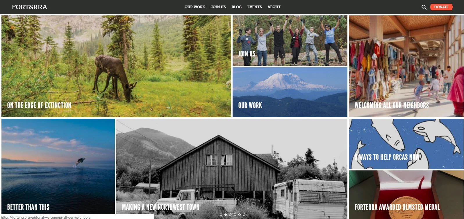
Improved information architecture (including new navigation toolbar and drop-down menu, and new footer with email sign-up form)
New home page
New landing page that introduced ability for staff to highlight timely campaigns, news, pages or blog posts
New content and UX writing for top 3 landing pages, including “Work,” “About” and an optimized sign-up page